We have the best jobs! As painters, we see and get to be involved in some of the most creative pieces of planning a home. Wall color, cabinet finishes, woodwork treatments, specialty paint, wallpaper – all the fun things! AND it’s all the elements you, as a homeowner, sees every day! So, we take our creative responsibility very seriously.
We work alongside some of the coolest designers in the industry, as they work with homeowners to put the palettes together and share ideas. Today, we are talking to one of those designers, Morgan Molitor from Construction2Style.
Morgan and her husband have been designing and transforming homes in the twin cities for many years. We grabbed a few minutes of her time to see what paint colors adorn the walls in her own home, how they make the space feel and how paint sheen matters.
Painterati: We've heard that selecting the right paint colors can be quite challenging. Can you shed some light on this?
Morgan: Absolutely. Choosing the right paint colors is no walk in the park. Trends come and go, safety concerns arise, and the dilemma of harmonizing shades can be overwhelming. The glossy vs. matte finish, maintaining consistency, and tackling the ‘DIY vs. professional’ debate only adds to the complexity.

Painterati: What's at the core of your philosophy when it comes to choosing paint colors?
Morgan: At the core of our philosophy is a simple belief: amidst trends, be true to yourself! Your home is your canvas, your retreat. Paint colors play a pivotal role in this, setting the tone for your daily experiences. Within our walls, we’ve embraced the power of hues, understanding how they can transform emotional landscapes, and provide comfort and inspiration.
Painterati: How can one approach the task of choosing paint colors for their home?
Morgan: Choosing paint colors for your home is a deeply personal and creative process, allowing you to craft a space that truly reflects your personality, style, and emotions. It’s more than just selecting shades; it’s about curating an atmosphere that resonates with you on a profound level. Some simple ways to help you with this process might begin with:
Self-Reflection Start by considering your personality, passions, and the emotions you want your home to evoke. Are you drawn to calming blues, energizing yellows, or sophisticated neutrals? Reflect on what colors make you feel relaxed, inspired, or joyful. Your home should be a reflection of your essence.
Creating Mood Boards Gather inspiration from various sources like magazines, Pinterest, or even nature. Create mood boards that capture the essence of your ideal home environment. Look for recurring colors and themes. This visual exercise will help you identify patterns and preferences.
Consider Natural Light Evaluate how natural light interacts with different colors throughout the day. Some colors may appear vibrant in sunlight but muted under artificial lighting. Test paint samples on your walls and observe how they change with varying light conditions.
Cohesive Palette While every room can have its unique personality, maintaining a cohesive color palette throughout your home creates a harmonious flow. Consider how different shades complement each other and transition from one room to another seamlessly.
Personalized Touches Incorporate your hobbies, travels, or cultural background into your color scheme. For instance, if you love the ocean, you might opt for shades of blue and sandy beige. If you enjoy vibrant cultures, consider bold and rich hues inspired by your favorite destinations.
Accent Walls and Focal Points Experiment with accent walls or focal points to introduce bold or contrasting colors without overwhelming the entire space. This technique allows you to add a pop of personality without committing to an entire room in a strong color.
Painterati: Can you reveal some of the core colors you've chosen for your home?
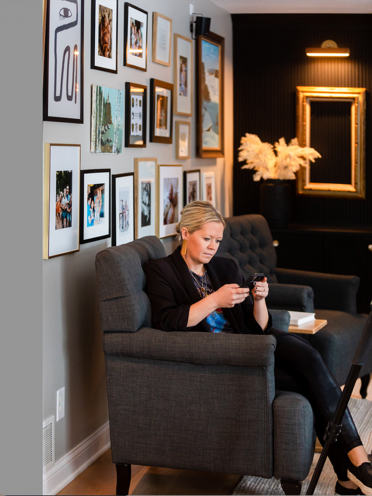
Morgan: We have three core colors that encompass our home: Snowbound, Mindful Gray, and Tricorn Black. Snowbound is a creamier white, used in larger areas. For the cozier living rooms, we went with Mindful Gray, and all of the window trim and interior doors are painted in Tricorn Black.

Mindful Gray (SW) Featured on wall

Mindful Gray SW and Tricorn Black SW Featured in Image

Mindful Gray SW, Snowbound SW and Tricorn Black SW Featured in Image
Painterati: Do you have any favorites when it comes to paint colors?
Morgan: Yes, I do. Apart from the core colors, we also adore Naval Blue, Forest Green, Dried Thyme, and a custom mural using our c2s brand colors. This mural, especially, was designed by a local artist named Kara from @Hotmess_Homemaker, and it perfectly captures our family's wild and adventurous spirit.
Painterati: Within the world of interior design, how significant is the role of quality paint to a home?
Morgan: Let’s first address the misconception that painting is a breeze – it’s an art, a craft that demands the right tools, skills, and time. Thankfully, with services like Painterati and Brush Masters, the process becomes streamlined.
Painterati: What is your take on paint sheen and when to use what sheen?
Morgan: Each sheen has its advantages and best uses, so the choice of sheen depends on the specific requirements of the surface being painted and the desired aesthetic effect. For us and within our home, on all of our walls, we used eggshell, and on all cabinets, we applied Semi-gloss. (For more about sheen, see our blog post on Sheen to be Seen).
A little more about the paint Morgan selected:

Snowbound, SW 7004
Snowbound, SW 7004 is a warm white from Sherwin Williams. It is a beautiful and versatile paint color, that we use often besides in our home. With its slight gray undertone, it falls into the category of cool whites, which can add a sense of calm and sophistication to any space.
The description paints a vivid picture, likening the experience of being surrounded by this color to stepping into a snowy glade. This imagery suggests a serene atmosphere, evoking feelings of peace and purity. The fact that it pairs well with other gray-influenced colors makes it even more versatile, allowing homeowners and interior designers to create harmonious color schemes that are both elegant and modern. This is why we paired this with Mindful Gray, which you can see in the photo below on the left, moving into the living room. It also pairs nicely with any gray beige, or “greige” as well.
If you’re considering using this color in your home, it’s great to know that it complements other shades with gray undertones. This means you can experiment with various combinations, creating a cohesive and stylish look throughout your living space. Remember, lighting conditions in the room can affect how paint colors appear, so it’s always a good idea to test a small sample of the paint in the actual space before making a final decision.
Mindful Gray by Sherwin Williams creates a warm and inviting ambiance, making every moment spent there truly delightful. To enhance its charm, consider pairing it with a cool white like Pearly White. The contrast between the warm gray and crisp white adds depth and sophistication, making your space feel both inviting and stylish. Embrace the harmony of this perfect pairing and let your living room radiate timeless elegance. While they say “grays” are out of trend, I think this gray is the perfect color blend that brings gray and greige undertones seamlessly. And if you still like grays like me, you can use gays despite the trends. While hints of blue and green add depth to this color, they won’t overwhelm your space. These subtle touches ensure Mindful Gray stays wonderfully balanced perfectly. And as you can see we are all about the colorful touches of blues and greens within our home, so this color is fitting for our lifestyle vibe.
Tricorn Black, SW 6258
Tricorn Black by Sherwin Williams stands out as one of the most reliable black shades due to its absence of undertones. With this pure black, you eliminate the possibility of unexpected warm or cool tones appearing on your surfaces, preventing clashes with other colors or materials in your space. It’s a choice that guarantees a sleek and cohesive look, adding sophistication without the worry of color conflicts.
Elevate your space with the trendy and endlessly chic Marten Black. This hue is anything but ordinary, ensuring your space is always on-trend and never boring. Paired with crisp white, it creates a timeless contrast that exudes sophistication. Being a true black, it effortlessly complements any undertone, making it a versatile choice for any design palette. Embrace the boldness and elegance of Marten Black, transforming your space into a statement of modern style.